Shavasa
Shavasa is a brand I created for my Graphic Production class. The brand is a yoga company that lets their customer relax and enjoy a rejuvinated, well treated experience. Shavasa is a yoga pose, also known as corpse pose. I chose the name for my branding project because I was looking for something that can stand out, something that is unique, and a word that you don’t hear everyday. As for the logo, I created it to look like a person bending. The bending is because in yoga you learn to be flexible and I believe the logo I created gives it an interesting look. I decided to use a subtle color for the logo but for the brand I added colors that would help the brand stand out. I came up with a pantone pink color and pantone orange color adding white to give it a finishing look.
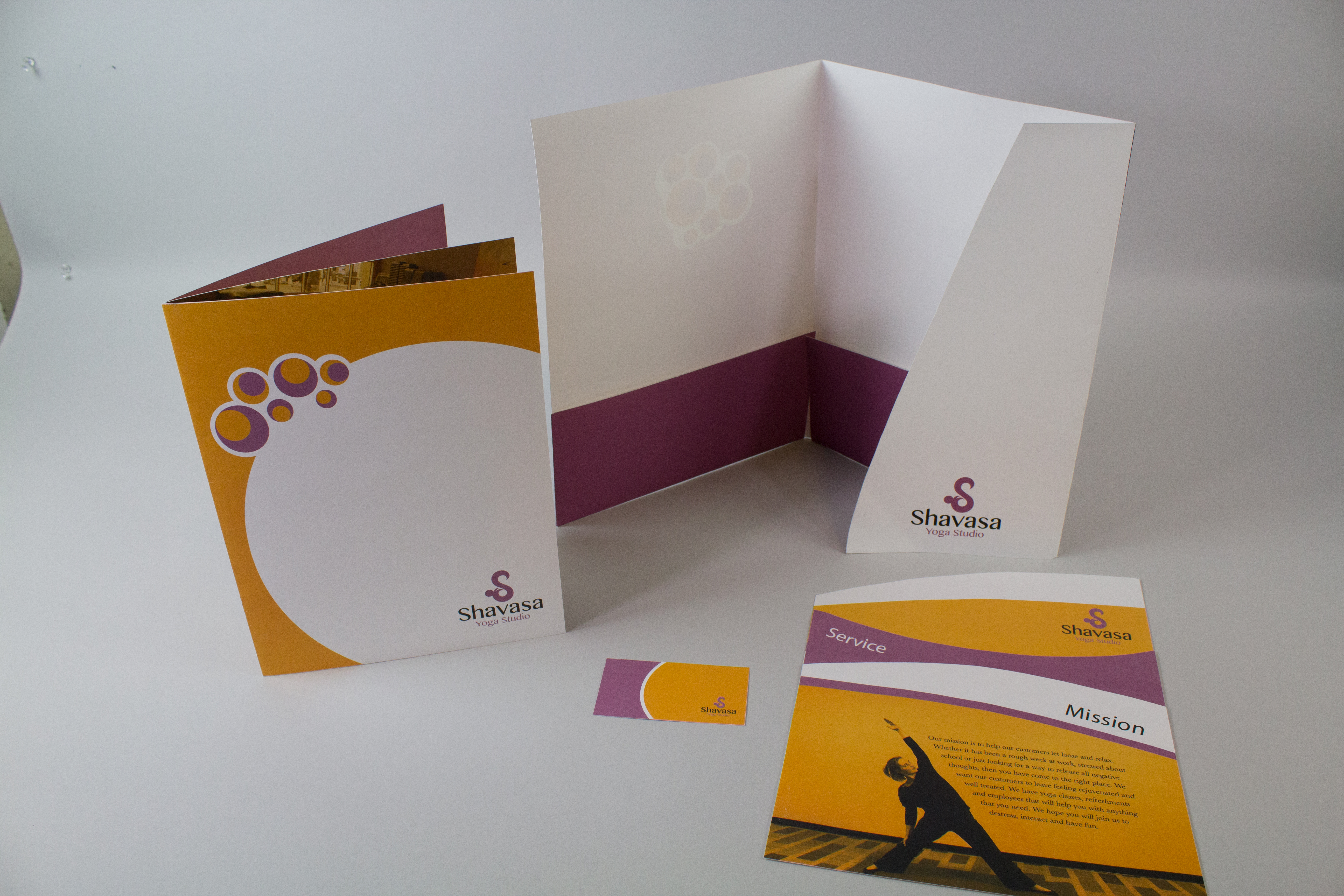
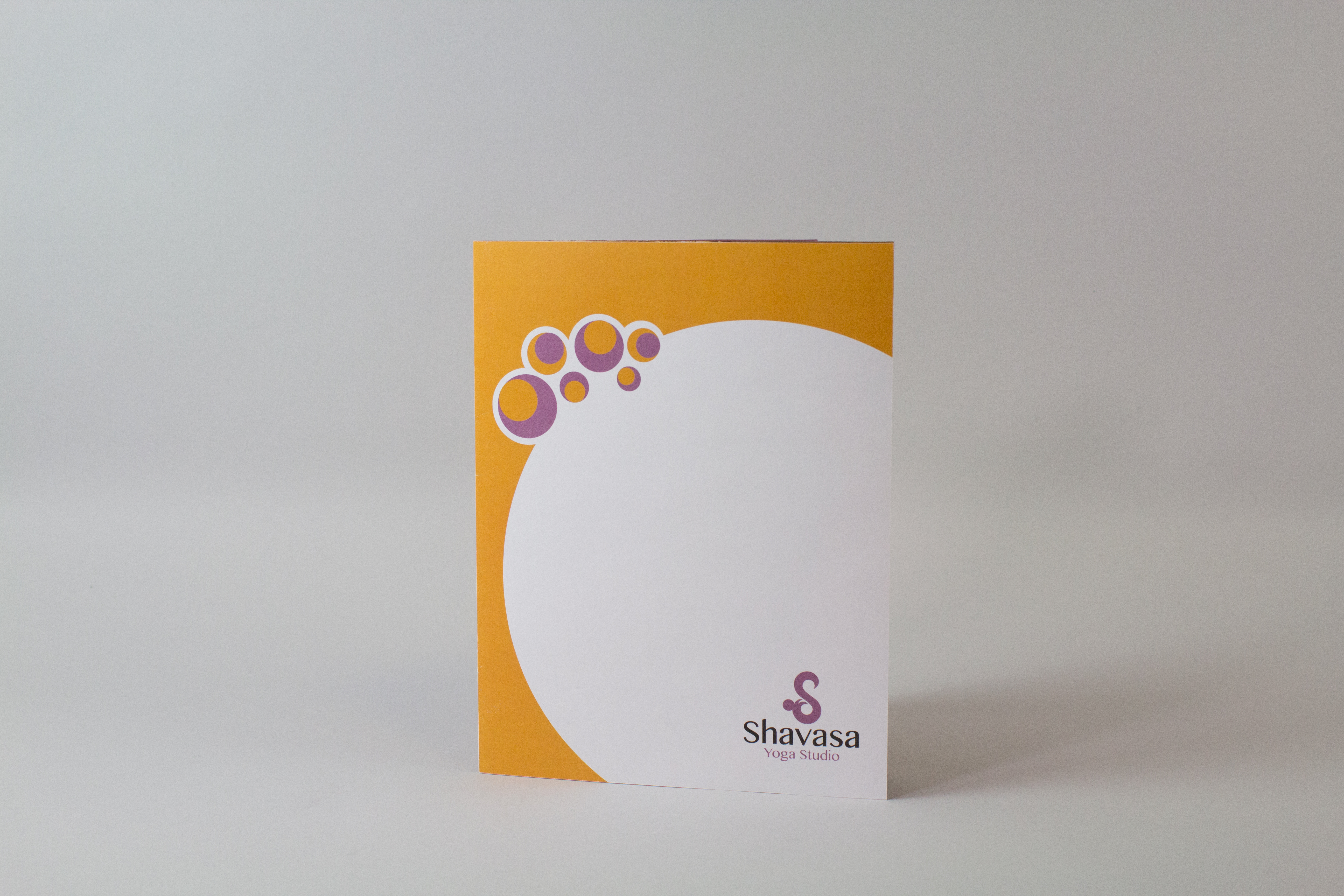
I created a folder that has a small strip that folds over the front of the folder and the edge of the strip is to be placed in a small cut so the folder won’t fly open and have papers fall out. I used the same color scheme of purple for the outside and white for the inside to keep the concept of the use of color interesting. I created an area to display the front of the business card for customers to see. On the back of the folder is the company’s contact information so people can reach the company without having to rumage through the folder.
Brochure
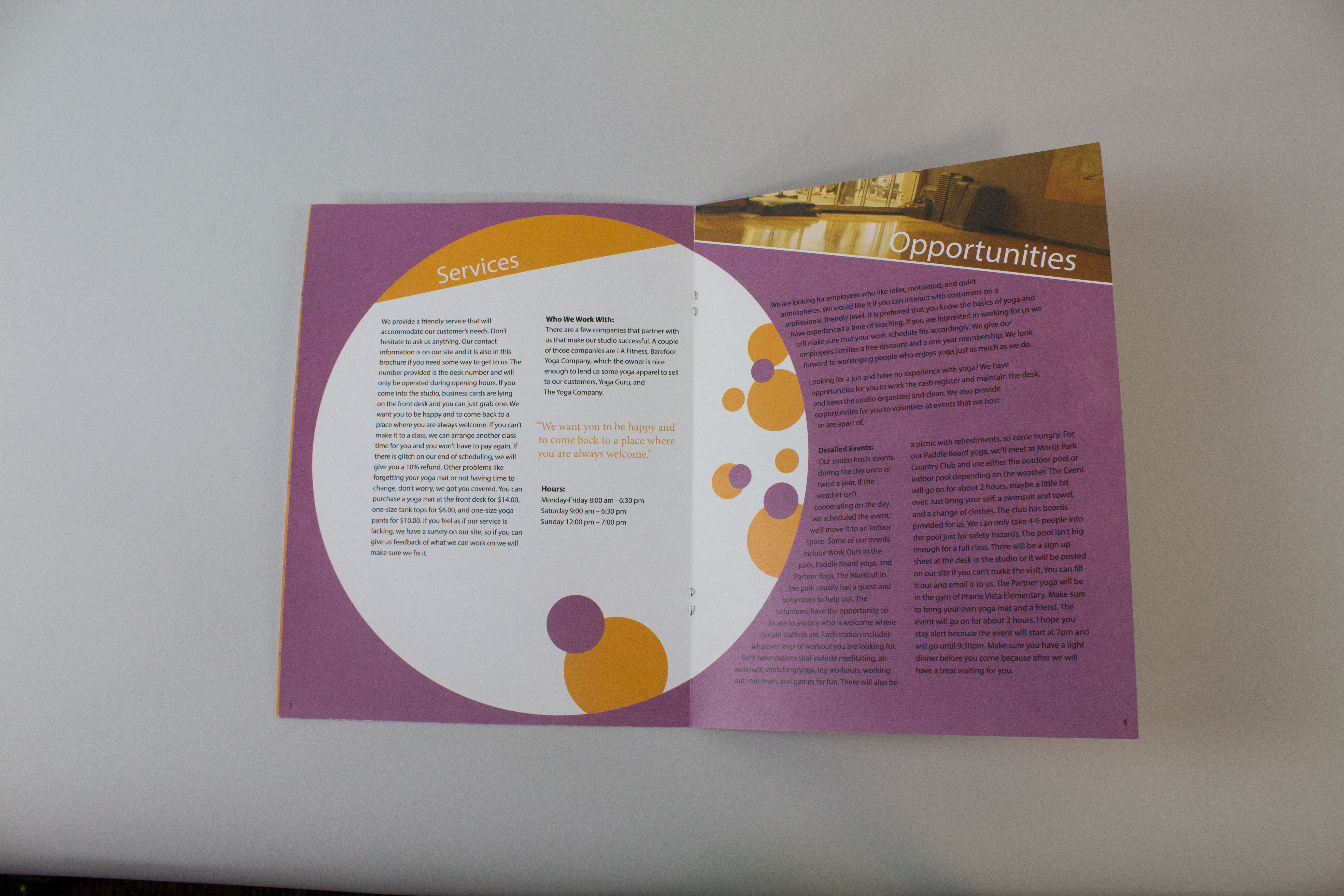
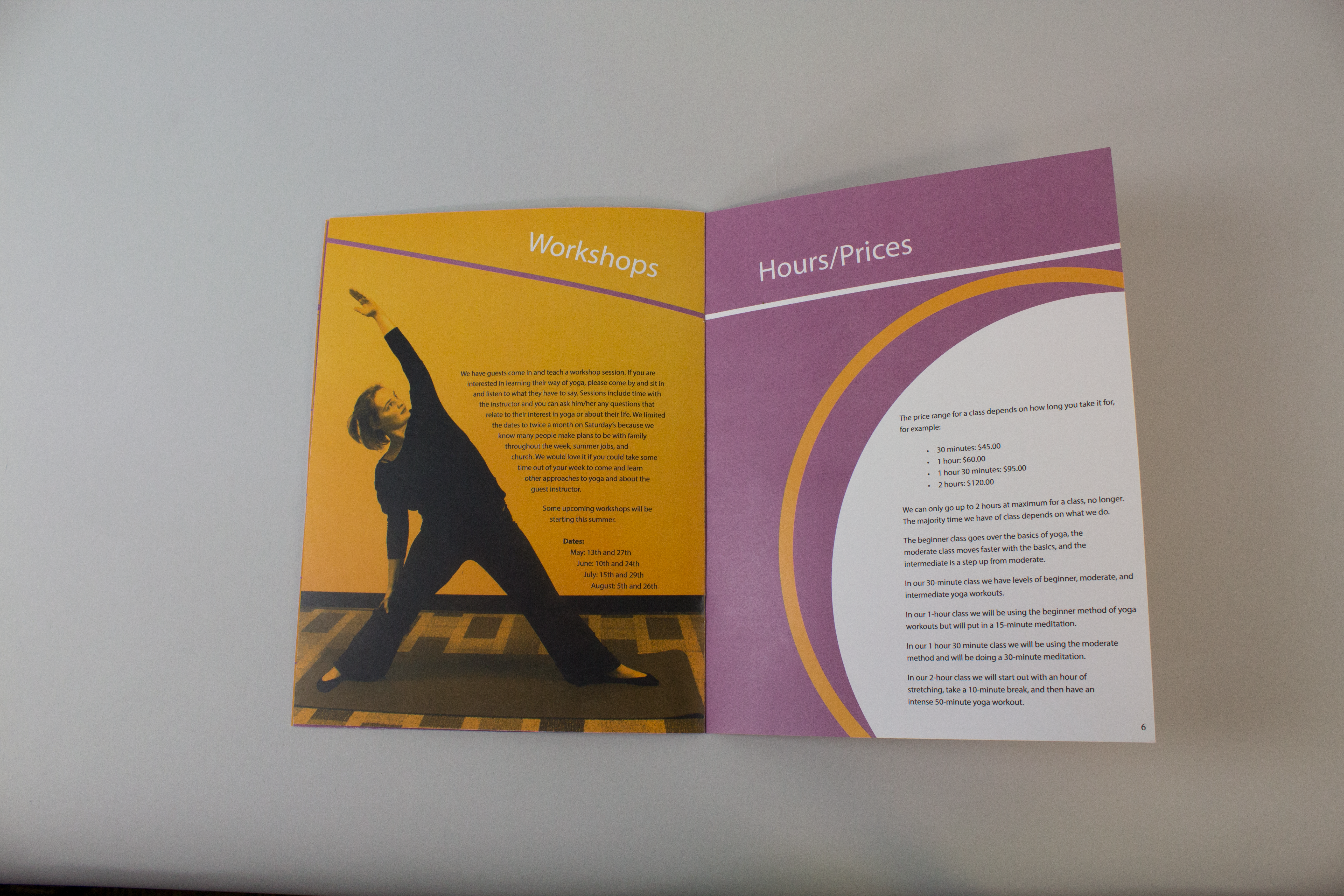
I created a brochure that includes pages about the company, its services, opportunities, workshops, and hours/pricing. The purple and orange color scheme is used throughout the brochure. I added some designs and pictures that I took so you can get the idea of what it’s like to be at the yoga studio. You will notice the circles throughout the brochure. I added them to represent flow and energy which is what the company wants for its customers.
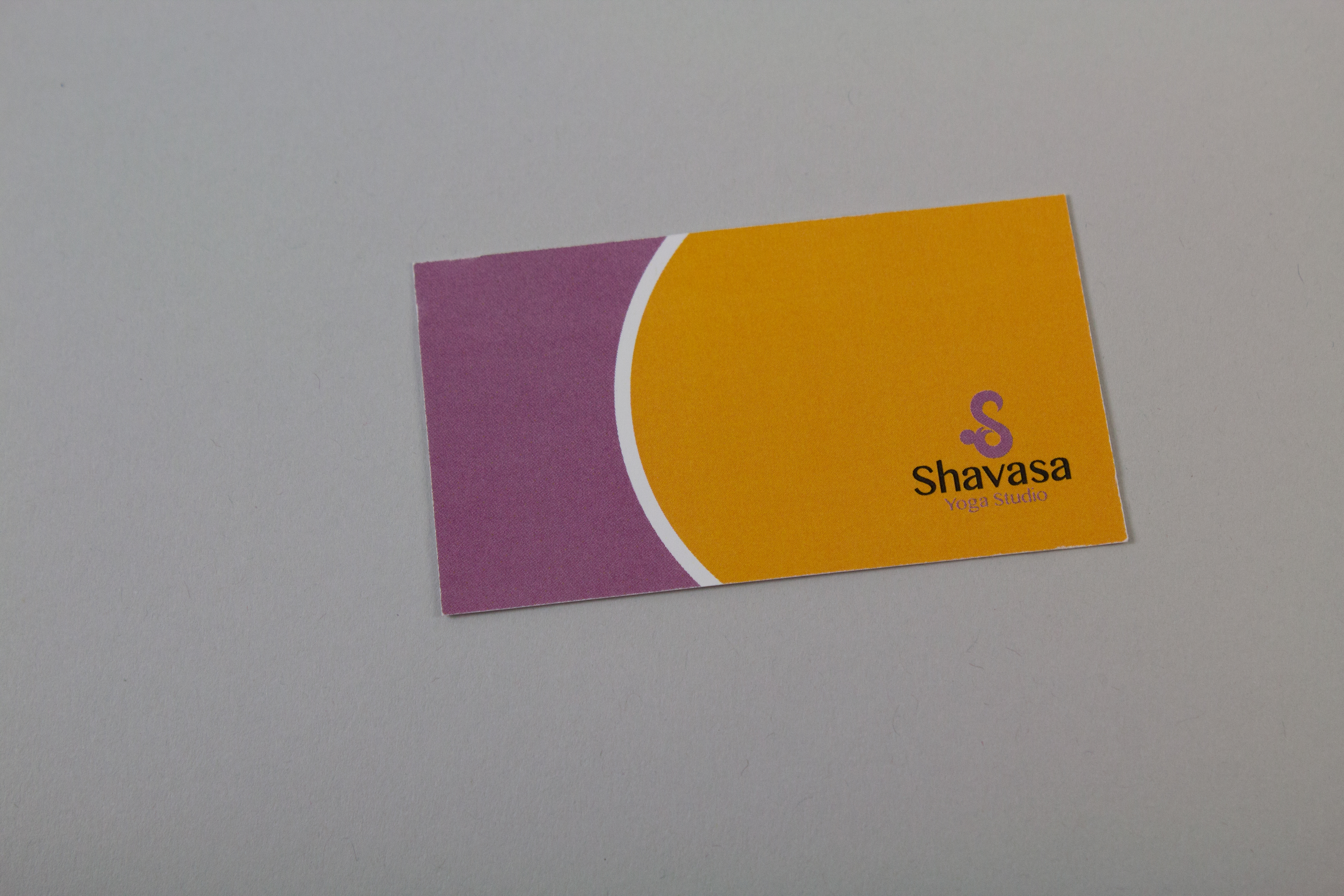
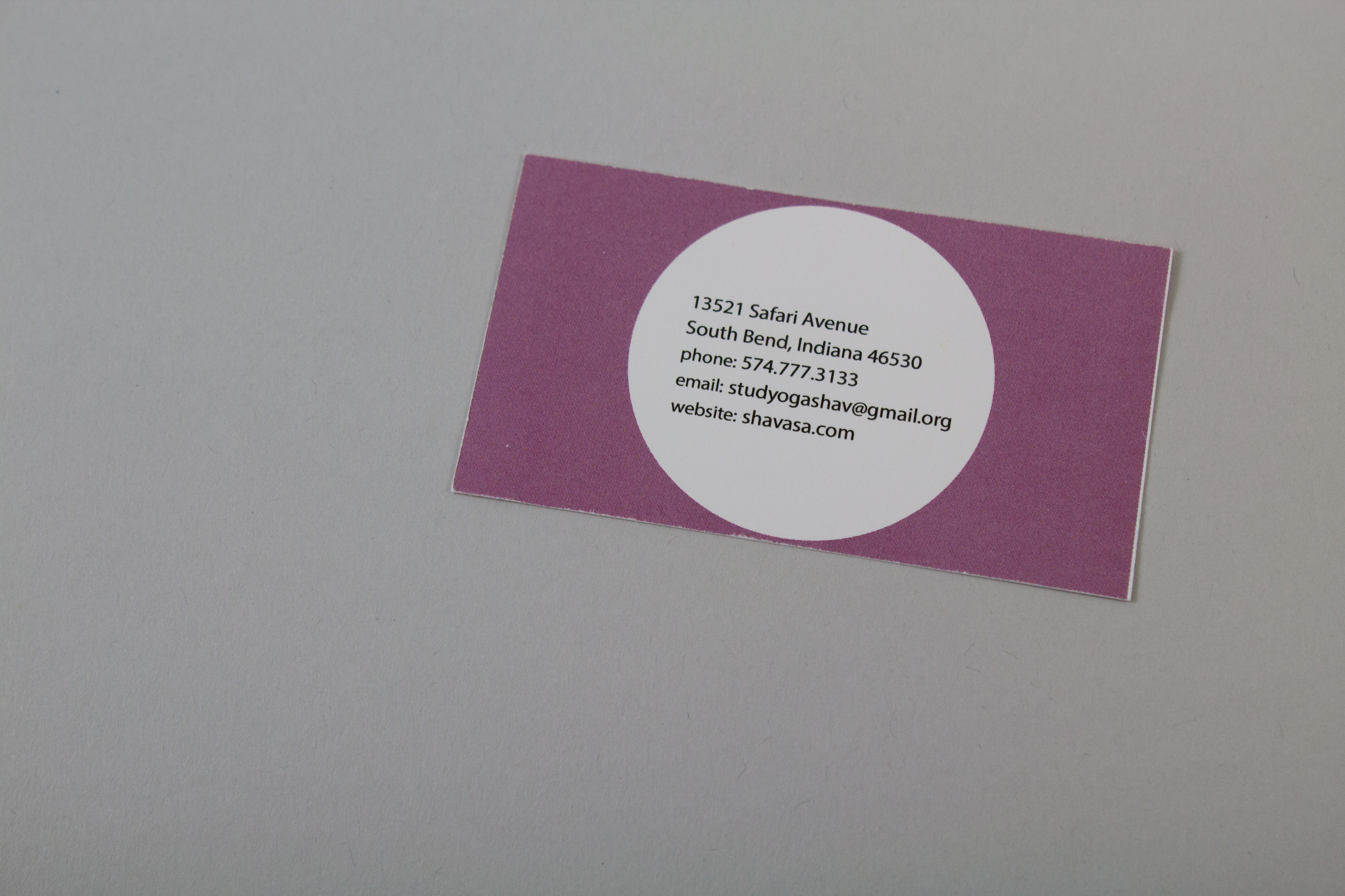
Business Card
I created a business card for my Shavasa project. I put the businesses contact information on it and added color that goes along with the Shavasa color scheme.
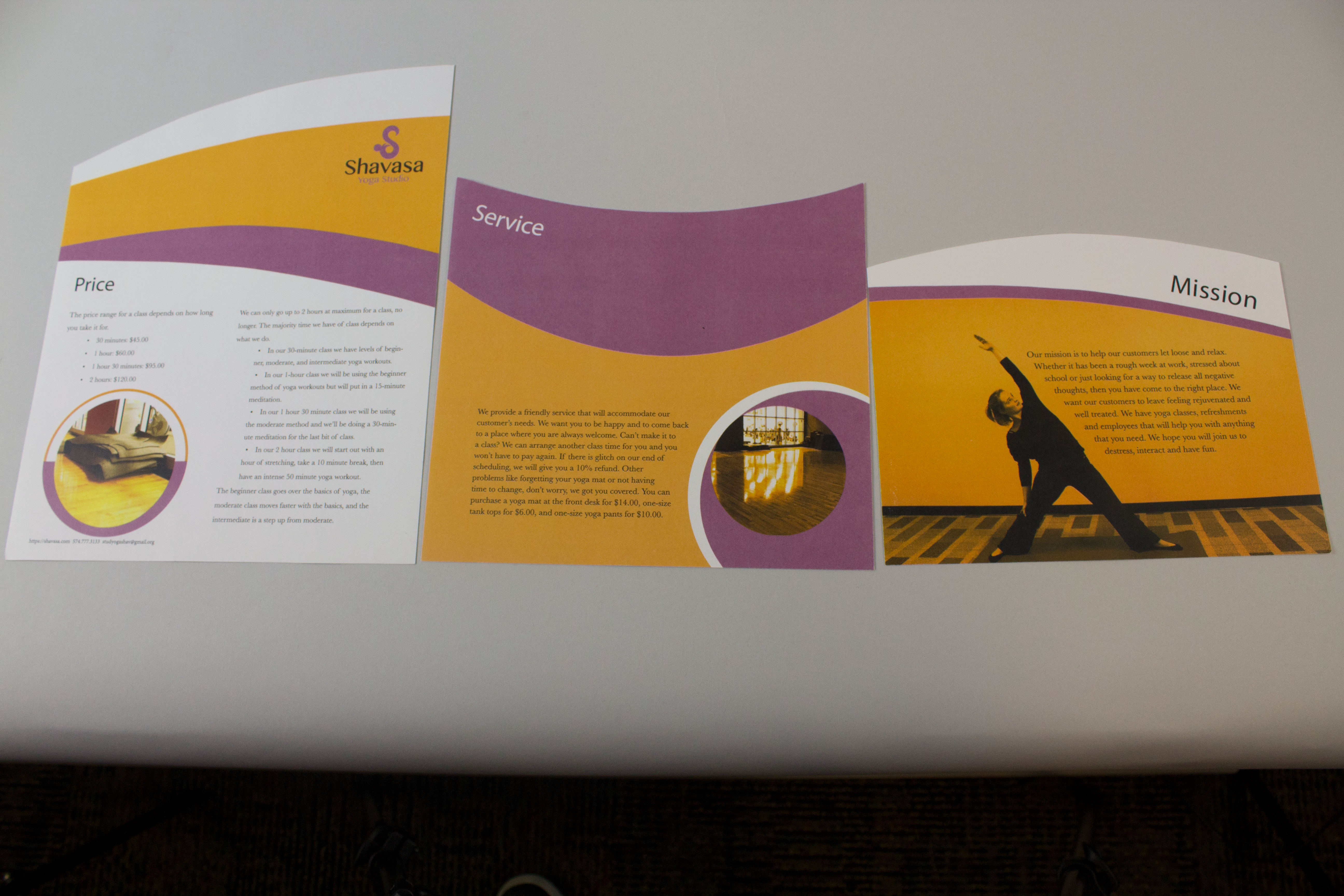
Staggered Sheets
For this project I made staggered sheets that give information about the yoga compa giving information about its service, mission, and pricing. The dielines I created have a wave look to it because I wanted to represent the company as calm and relaxing, and when listening to the sound of waves, they tend to relax people. The color scheme, which is shown throughout the project, uses colors that complement each other to emphasize the vibrance. I want the customers to feel welcomed when in an environment around people who like to relax.
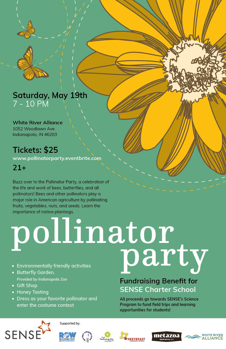
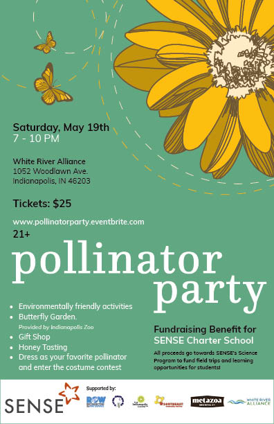
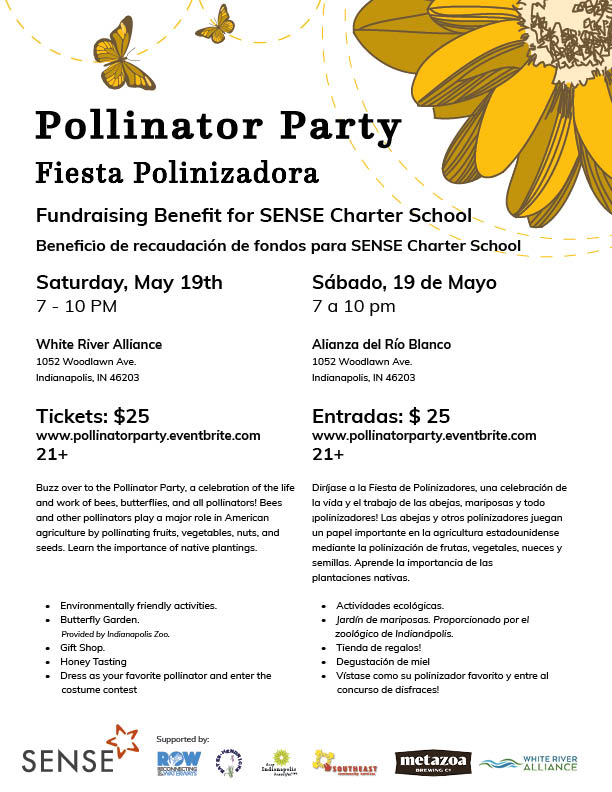
Pollinator Party Poster, SENSE Charter School
I created a poster for a fundraiser party to benefit the SENSE Charter School. The poster has a flower that represents the growth within the community of the school and togetherness. I added in a butterfly and showed the movement so you can get a sense of movement around a flower from the pollinators perspective. The green background is suppose to represent the green grass and the growth of the flower.
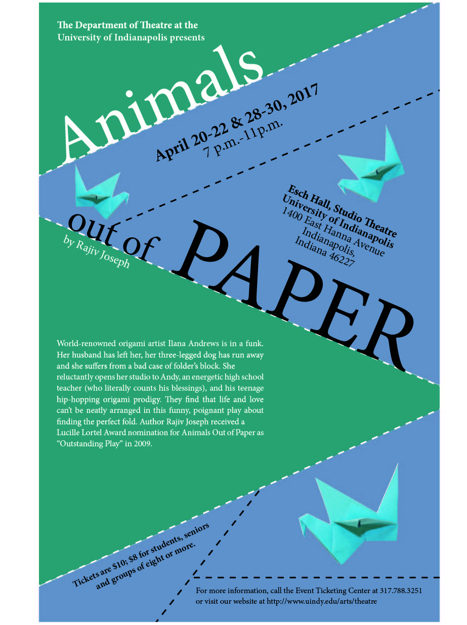
Animals Out of Paper Poster
I read a book called “Animals Out of Paper” and created a poster about it for a play. The book is about relationships and uses oragami to examine the relationships. I showed the uniqueness of the play by angling text and lines to represent the characters. I made a bird out of paper to represent the oragami part of the story, and it was referenced in the book about an eagle and I wanted to use that reference by putting my own creative twist of oragami into it.
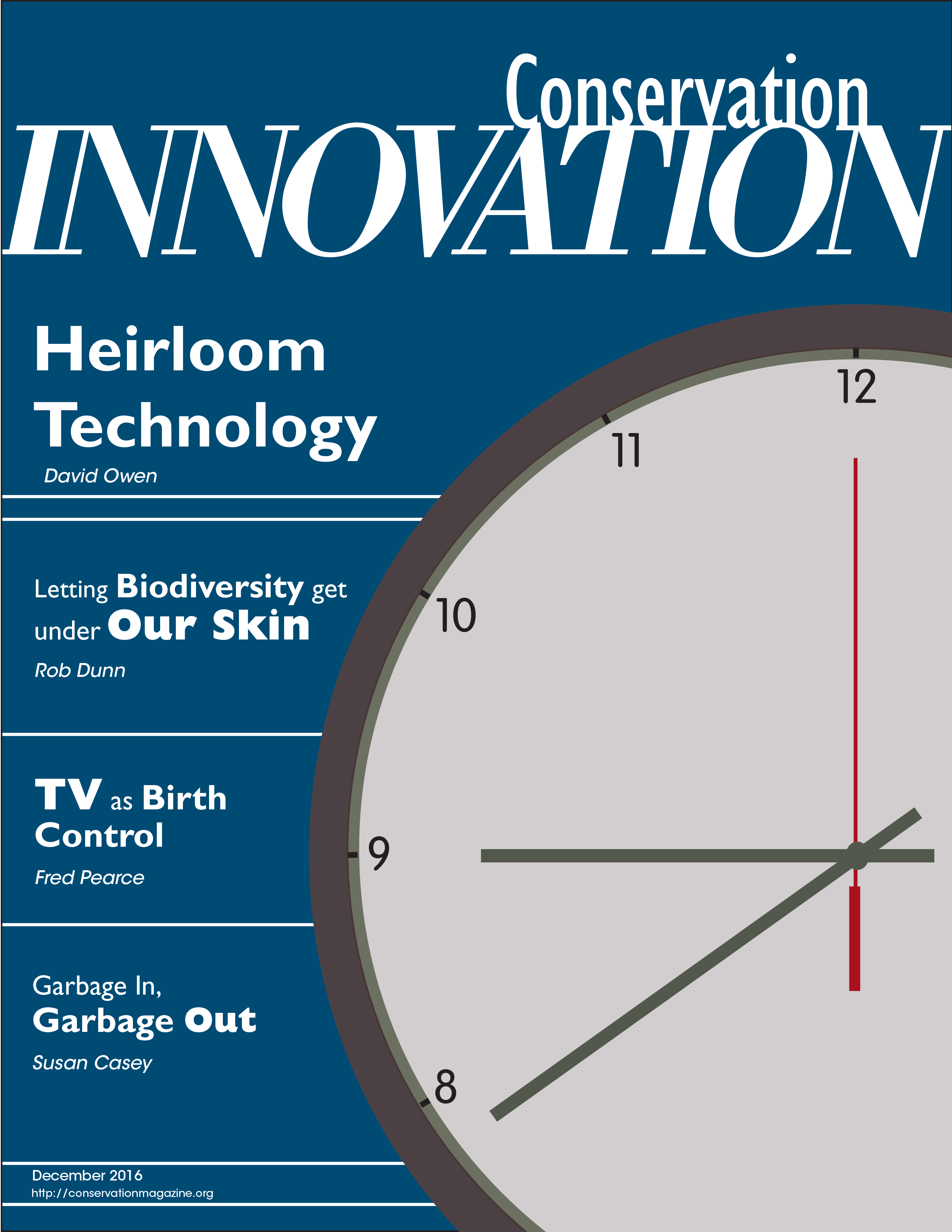
Heirloom Technology Magazine Cover
For this project I was given an article to create magazine layout pages, and after that project I created a cover of a magazine. The article I was given was about Heirloom Technology, and on my magazine I wanted to show the use of technology and what better way to show it than by time. The clock is suppose to represent the time. I worked with the hierarchy to show interest in what represents technology the most with the Heirloom Technology being the boldest.
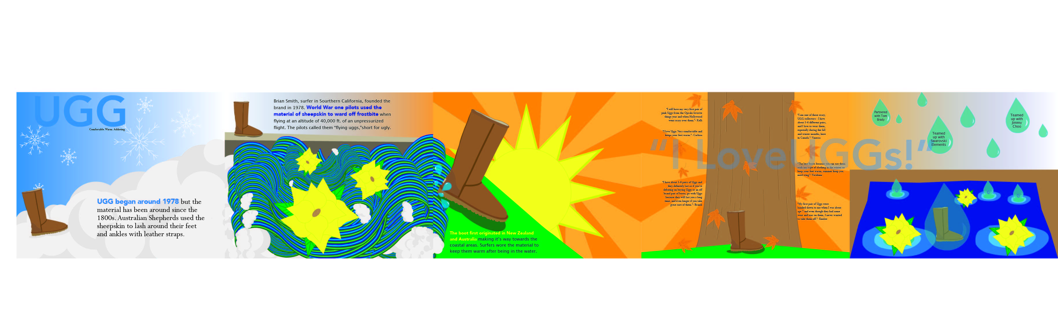
Sequential Narrative: Ugg Boots
For this project we chose an item/object and created a sequential narrative out of it. The object I chose was Ugg. Ugg is a seasonal object and I wanted to show that throughout the narrative. I created the idea as if it were a childrens book, because illustrations resemble a child-like look to it depending on the colors chosen, designs and object(s). I have the ugg boot in each panel and as you read through the narrative, you are learning about the history of how the Ugg Boot came about, reviews they have received and people/brands Ugg teamed up with. As for the seasonal aspect of the narrative, the panels transition to the other by what you would see within that season.
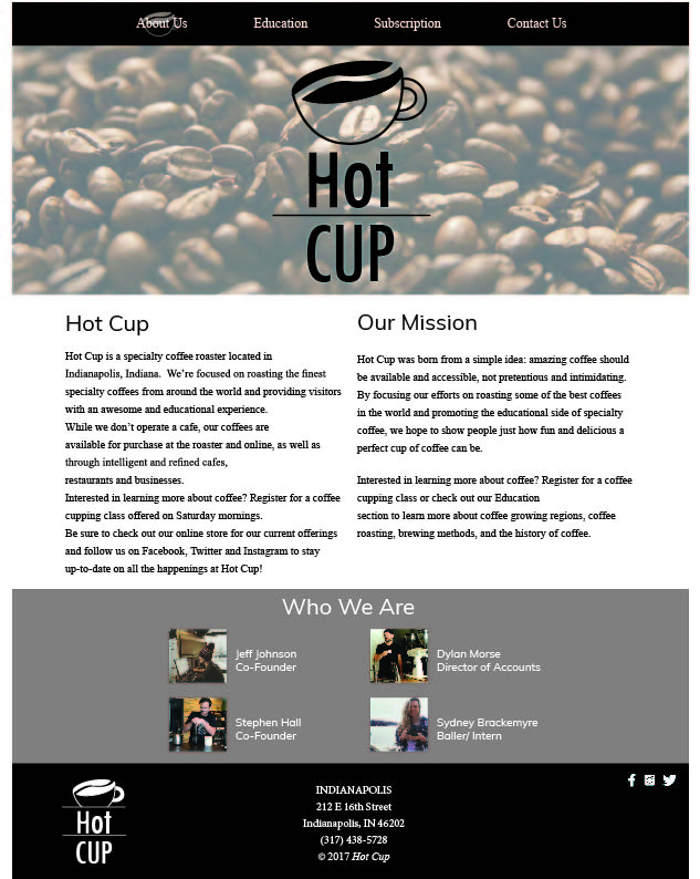
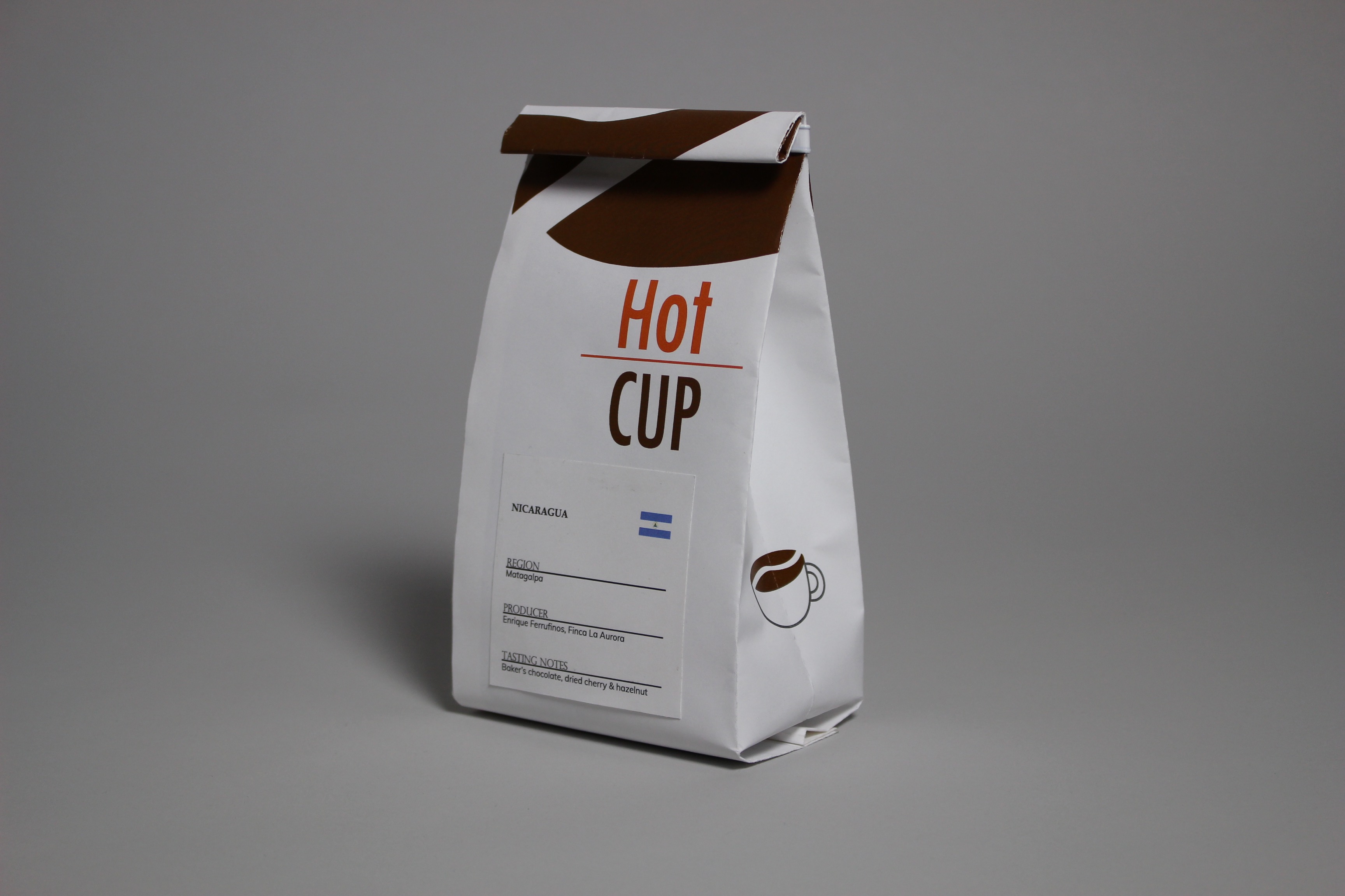
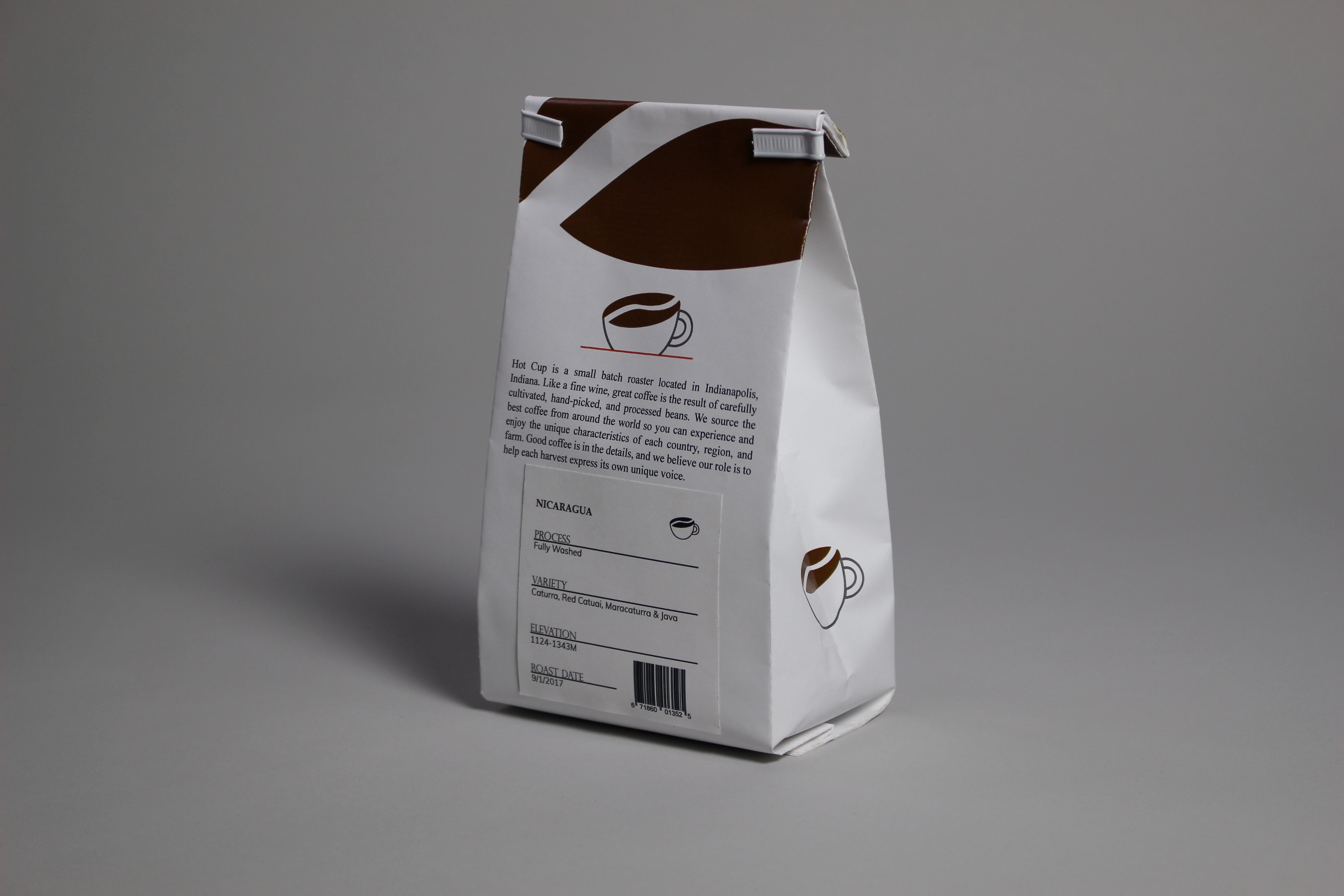
Hot Cup
Hot Cup is a company I created for a branding project. The research is inspired by a company that is located in Indianapolis called Tinker Coffee Co. The company is about great coffee as well as getting an educational experience with hands on cupping classes, learning about the history of how coffee beans started, and being a part of an environment of friendly people. I created my own logo, name, website, and package. The logo combines a coffee bean and a cup so that customers clearly see what the company sells. I came up with the color scheme of orange, brown, and grey because I want to show that the company sells freshly roasted beans.
Package
Hot Cup is a company that is about selling their brand, coffee beans, to coffee shops, inwhich that company will use to sell to their customers. I created a package that looks similar to a coffee bag but the only difference you see is the design. The design is different is because it is my own. I chose to create a coffee bean in illustrator so customers can notice that it is a bag of coffee when looking at it. The paper glued to the package I created to look like a stickers. I made them so customers can see how much coffee they are purchasing, what kind it is, and where it is from.
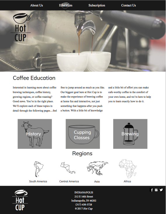
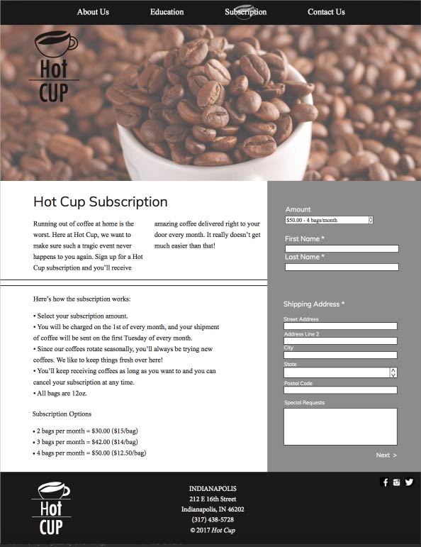
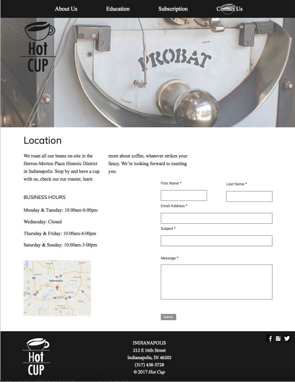
Website
I created a website containing information about the company, the history of coffee, a subscription, different kinds of coffee, and where Hot Cup is located. I chose the black, gray and white color theme to go along with the brand of Tinker’s company but put my own twist to it.